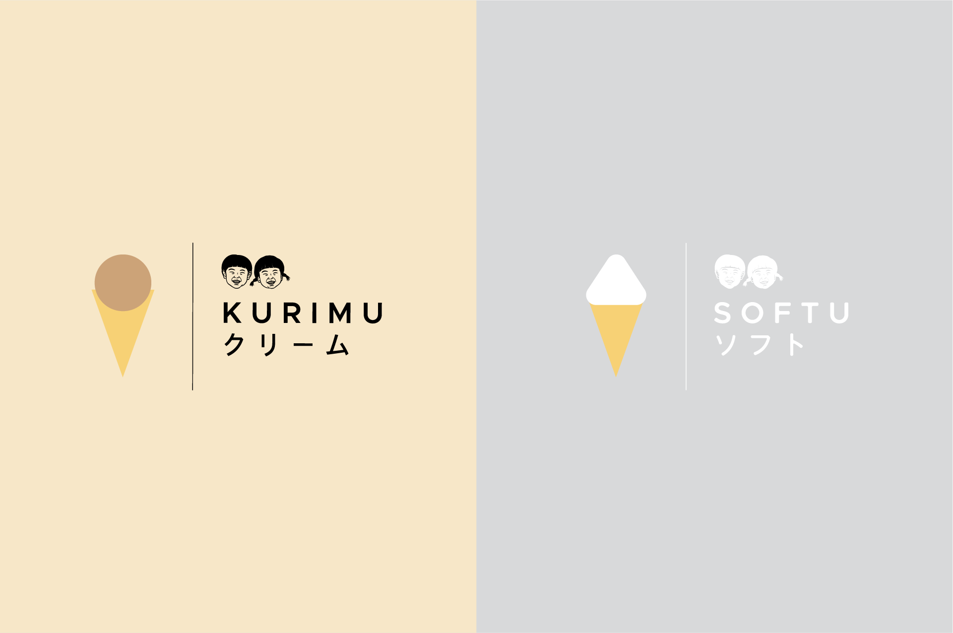
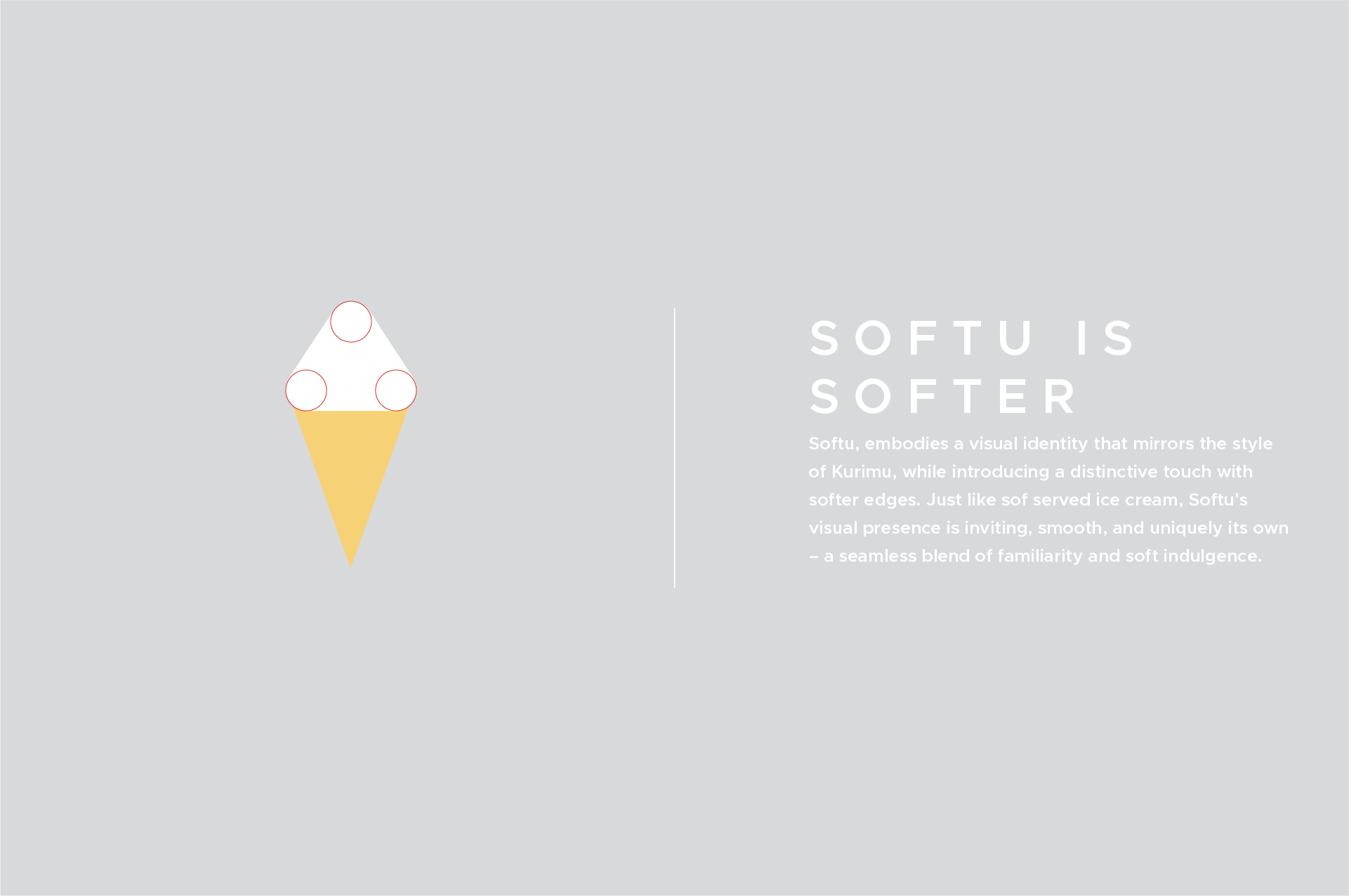
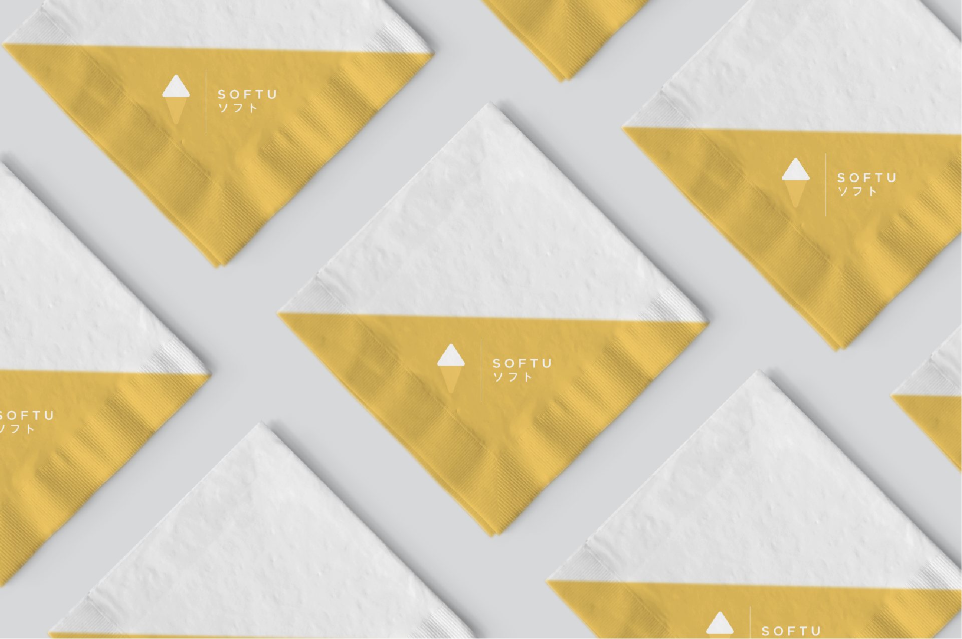
Softu
A soft serve sub-brand spun out of Kurimu's existing identity. LLIT kept the typographic discipline of the parent brand while introducing softer curves and a pastel palette — creating a distinct but clearly related sibling brand.
Making soft serve feel like a natural extension of Kurimu—familiar, softer, its own.

Challenge
Carry the trust of Kurimu while creating a distinct identity.
Softu needed to leverage Kurimu’s equity yet signal a new offer focused on soft serve. The task was to mirror Kurimu’s sophistication while softening the forms, palette, and tone so Softu stands on its own without breaking family cohesion.


No items found.

SCOPE
Sub-brand Identity · Packaging · Brand Extension
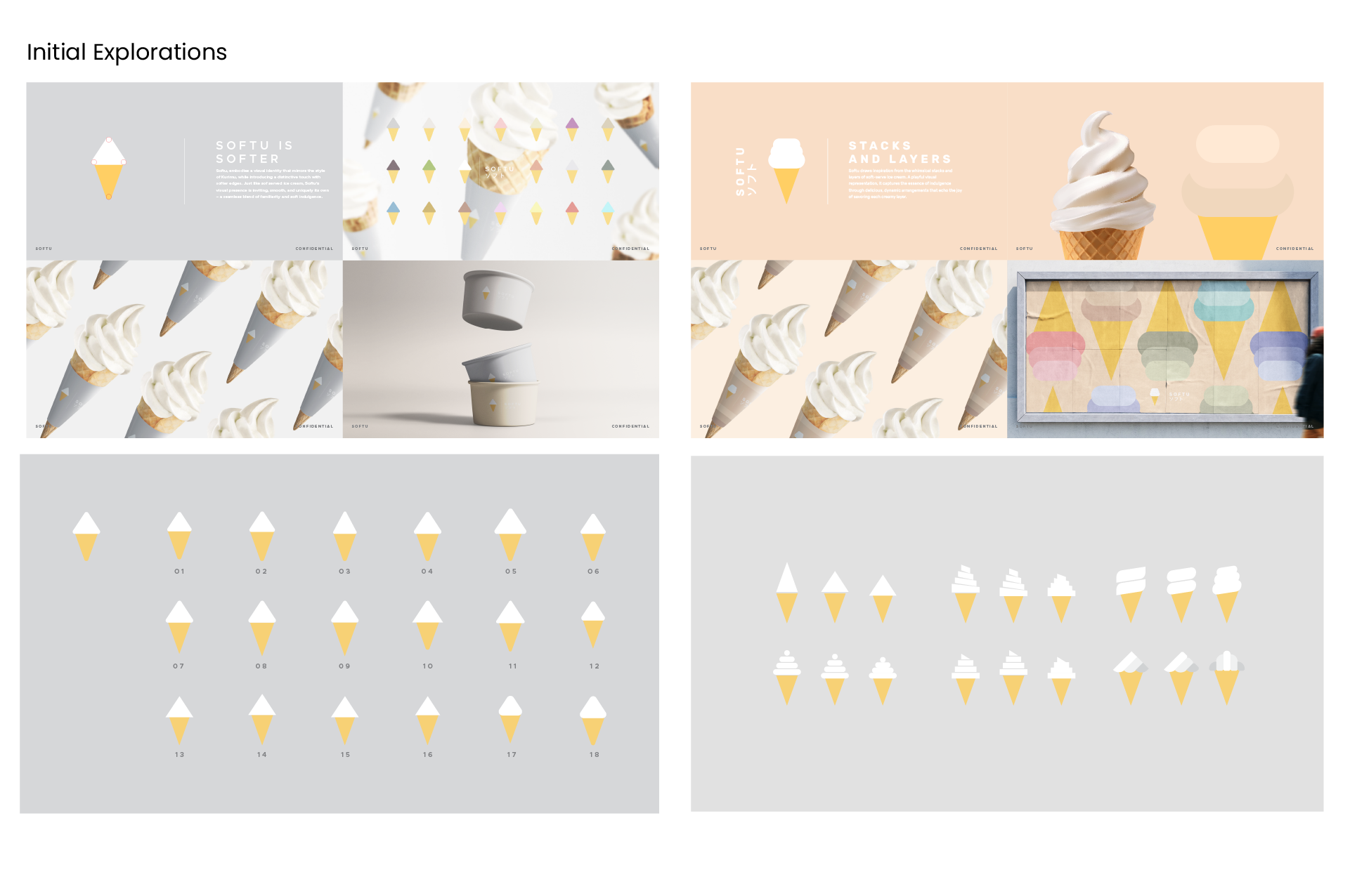
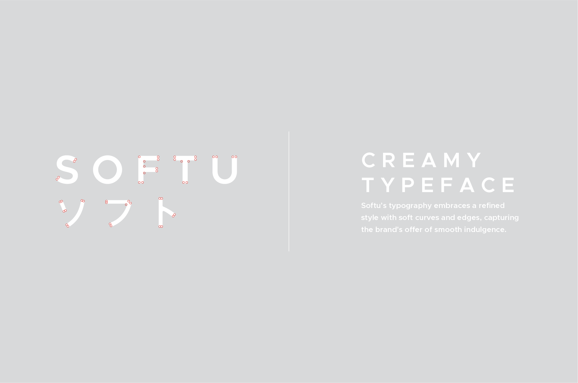
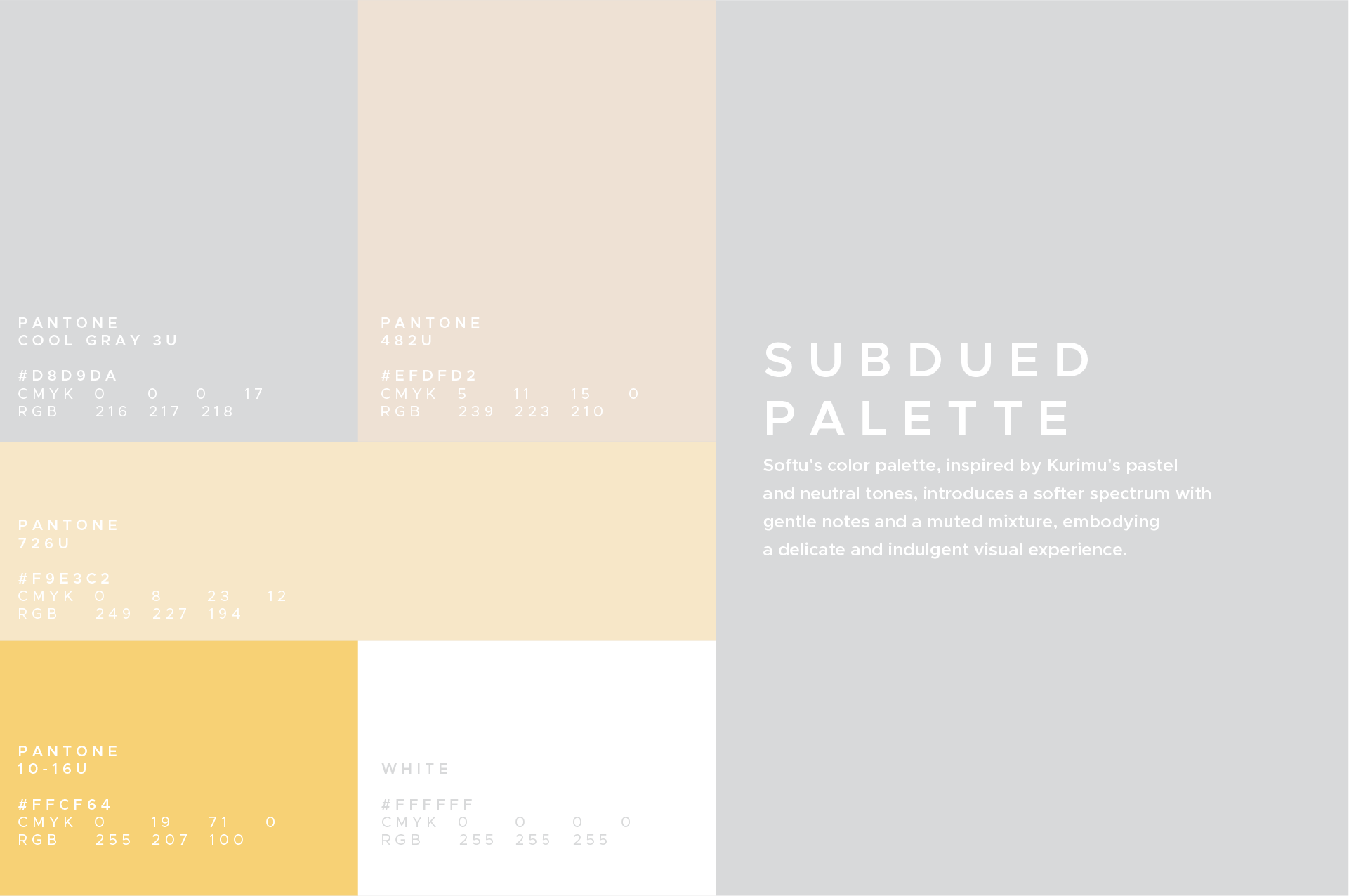
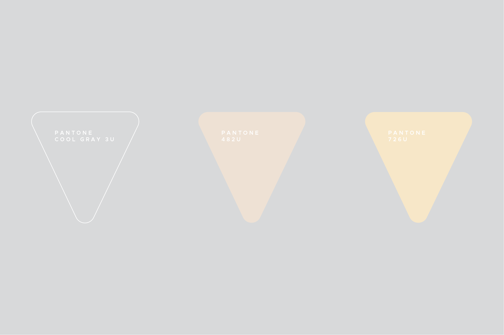
A calm, creamy system with shared DNA. We kept Kurimu’s typographic discipline while introducing rounded, “creamy” curves and a muted, pastel-forward palette that reads smooth and inviting. The result is a sub-brand that’s clearly related—same structural logic and typography—yet unmistakably Softu in its softer edges, tones, and texture.