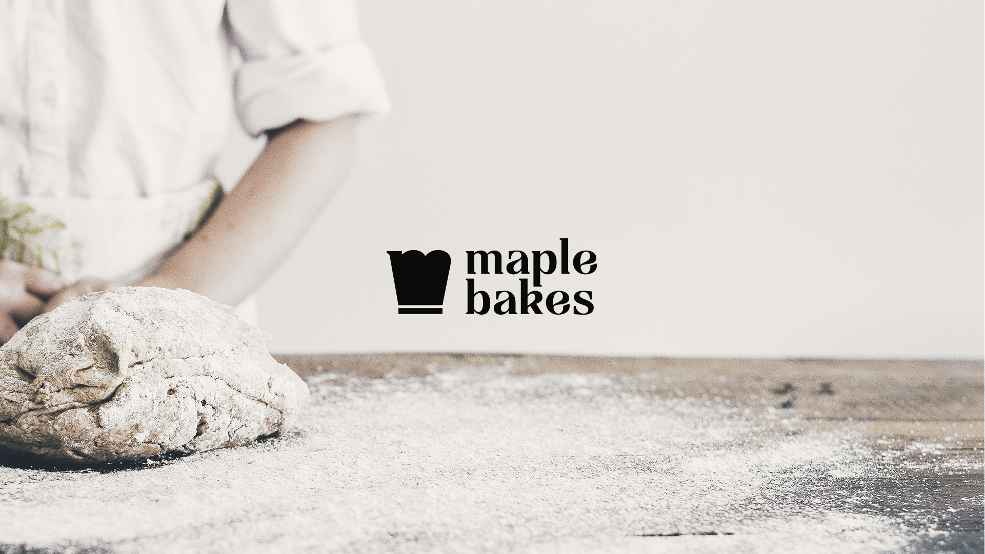
Maple Bakes
A homemade bakery brand elevated into something premium and contemporary. The identity centers on an "M" abstracted into a baker's hat, paired with warm maple tones and a typographic system that balances old-world charm with modern clarity.
A modern take on the timeless craft of baking.
Challenge
Create a brand that feels artisanal yet refined.
Maple Bakes needed a visual identity that honored the warmth and honesty of homemade baking while appealing to a more discerning, design-conscious audience. The challenge was balancing tradition with contemporary clarity — crafting a brand that feels both familiar and fresh.


No items found.
SCOPE
Brand Identity · Packaging · Brand Strategy
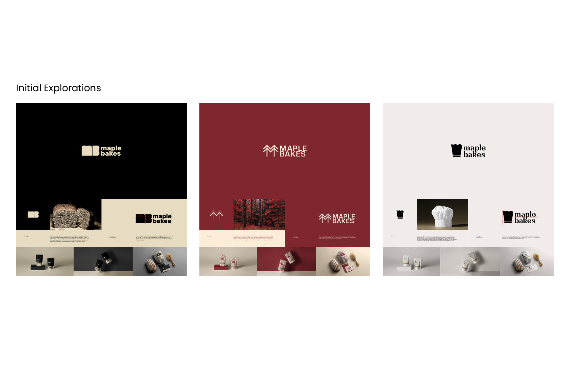
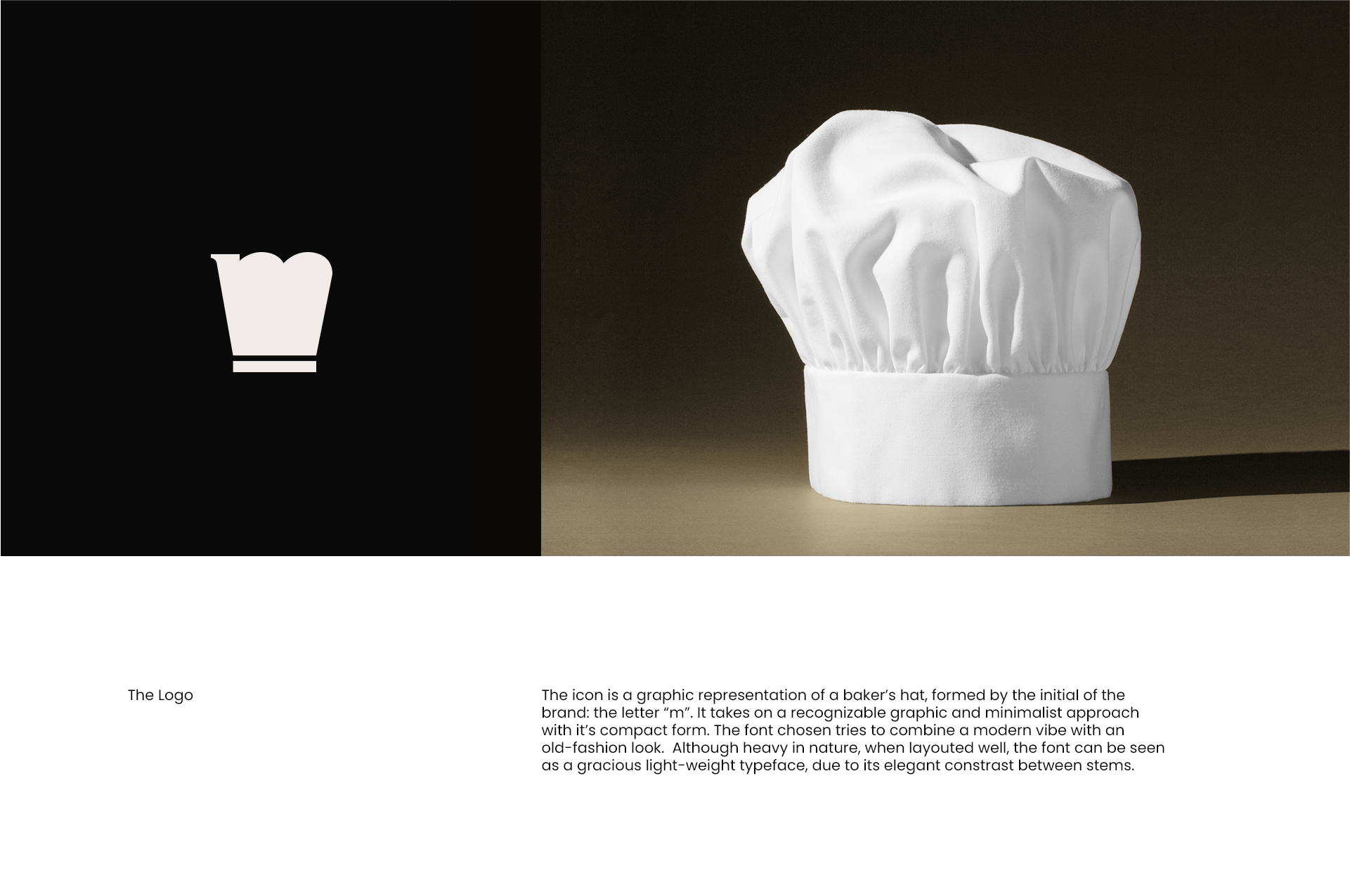
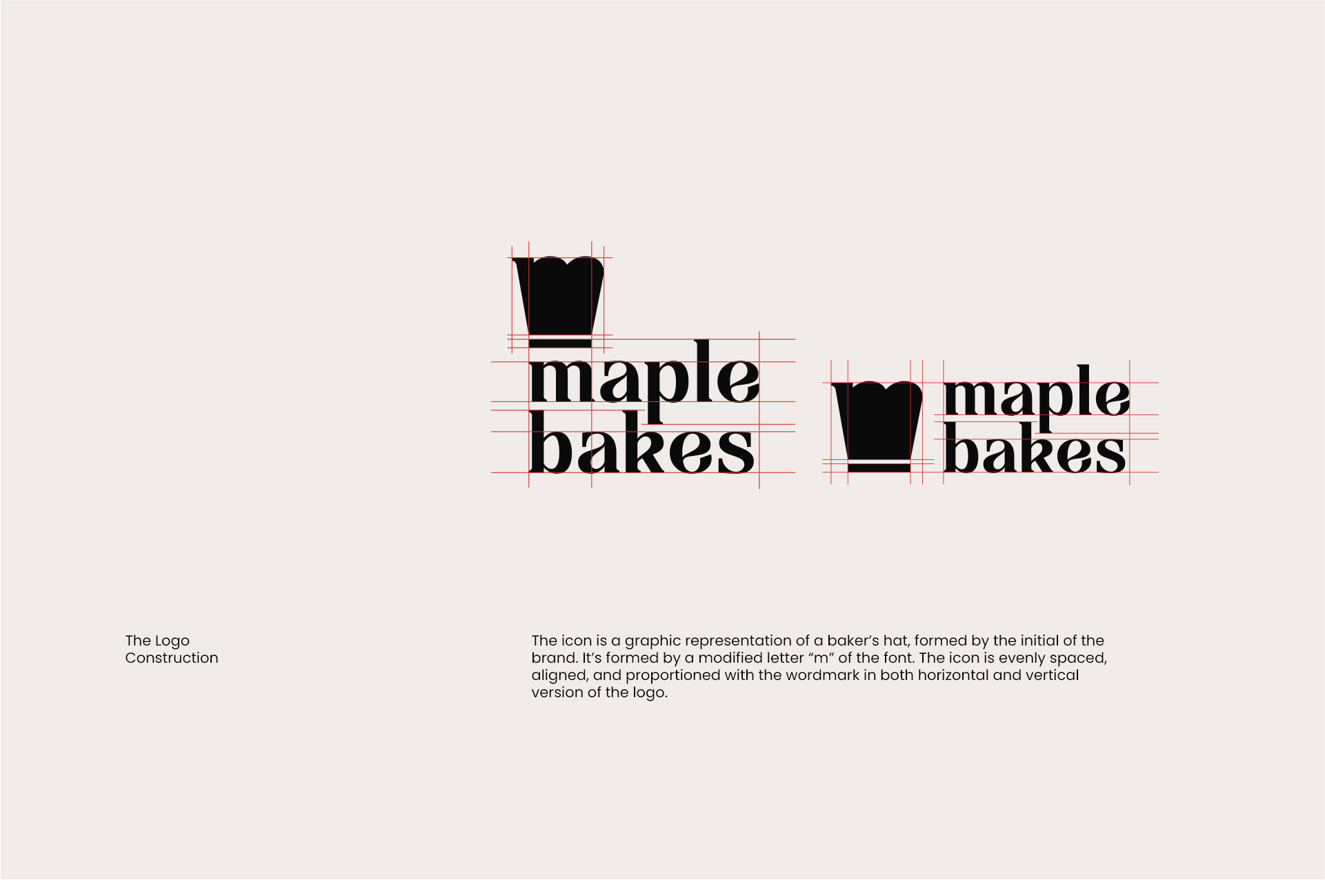
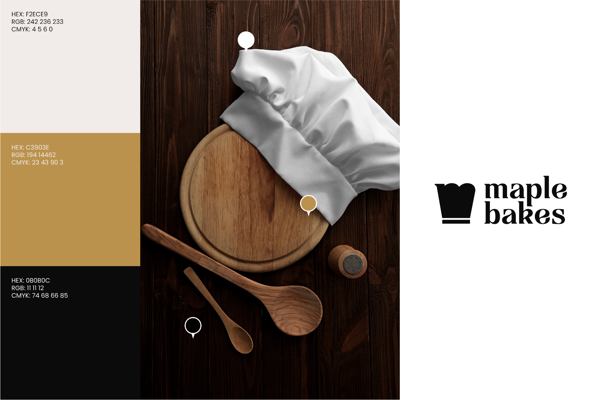
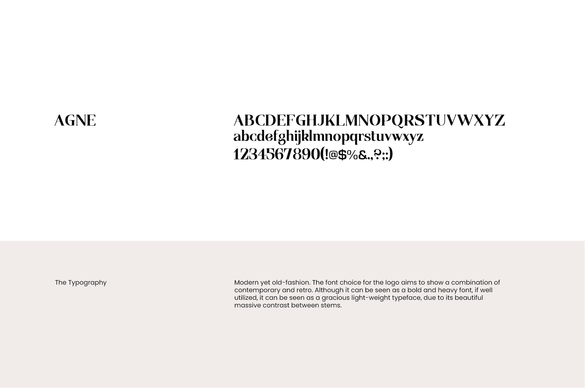
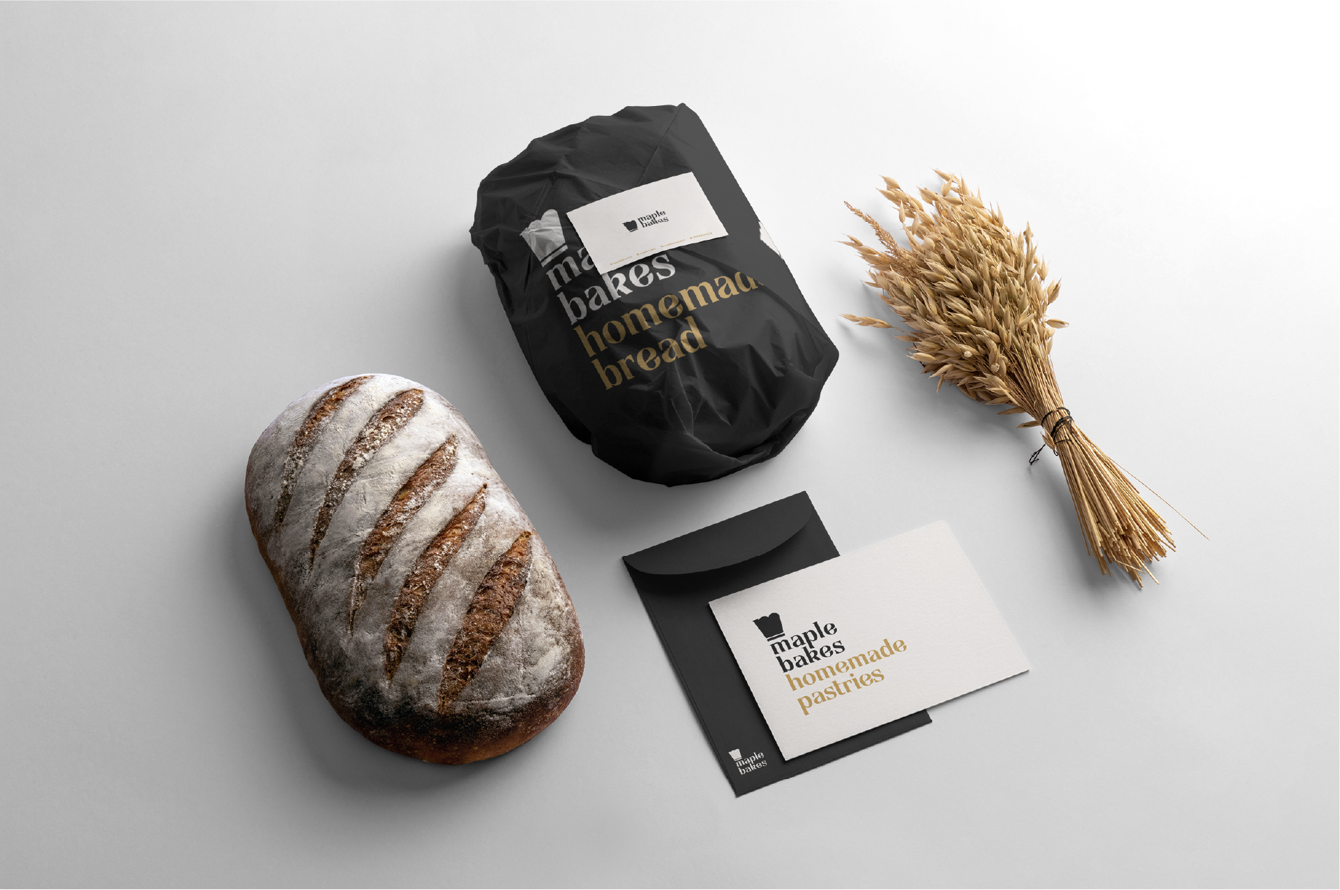
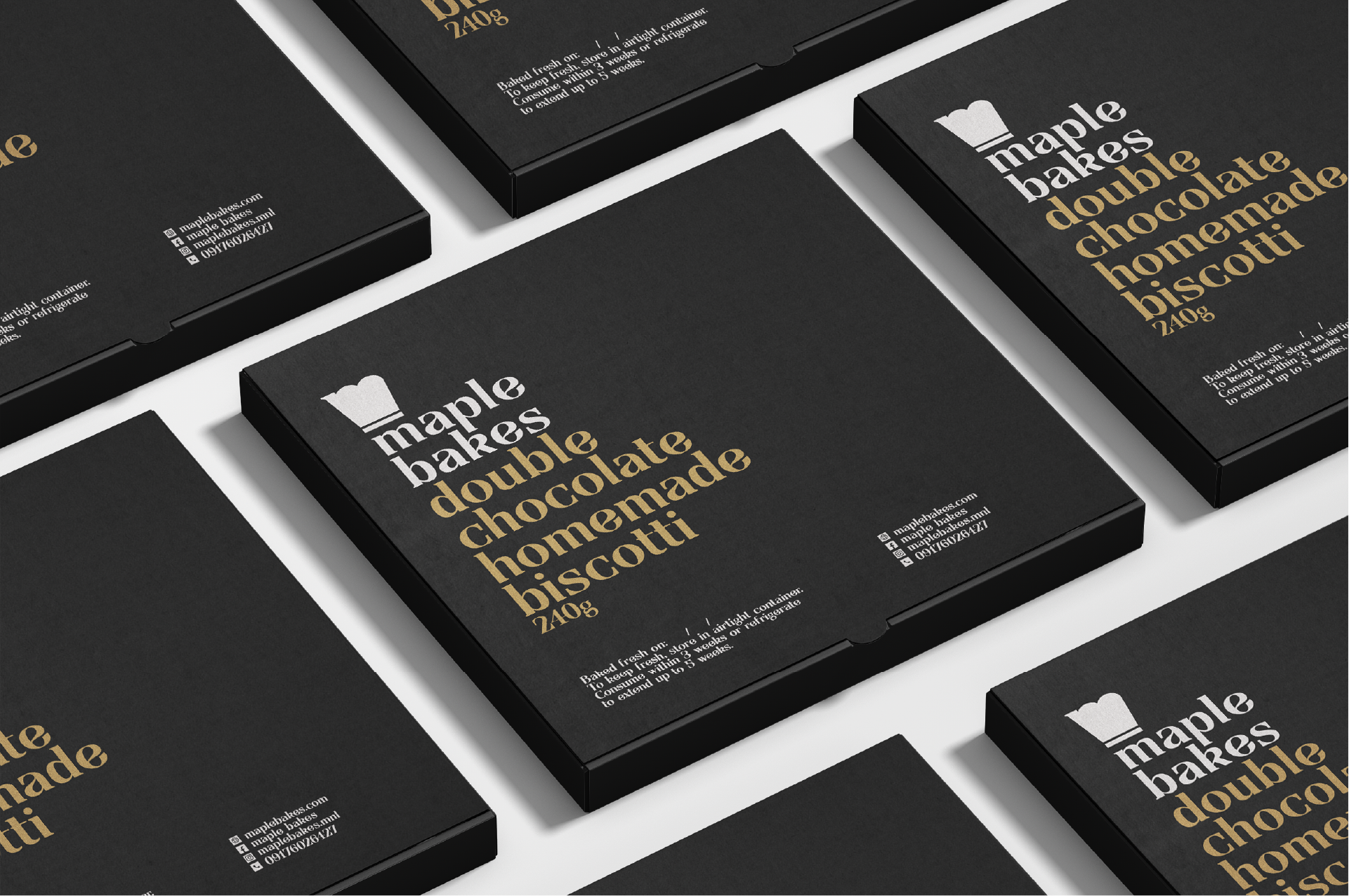
The logo takes the shape of a baker’s hat, abstracted from the letter “M,” symbolizing skill and warmth in one refined mark. Paired with a typographic system that fuses old-fashioned charm with modern simplicity, the identity embodies quiet confidence. The palette — warm maple tones, soft neutrals, and deep black — evokes comfort and sophistication, creating a brand that feels inviting, premium, and timeless.
