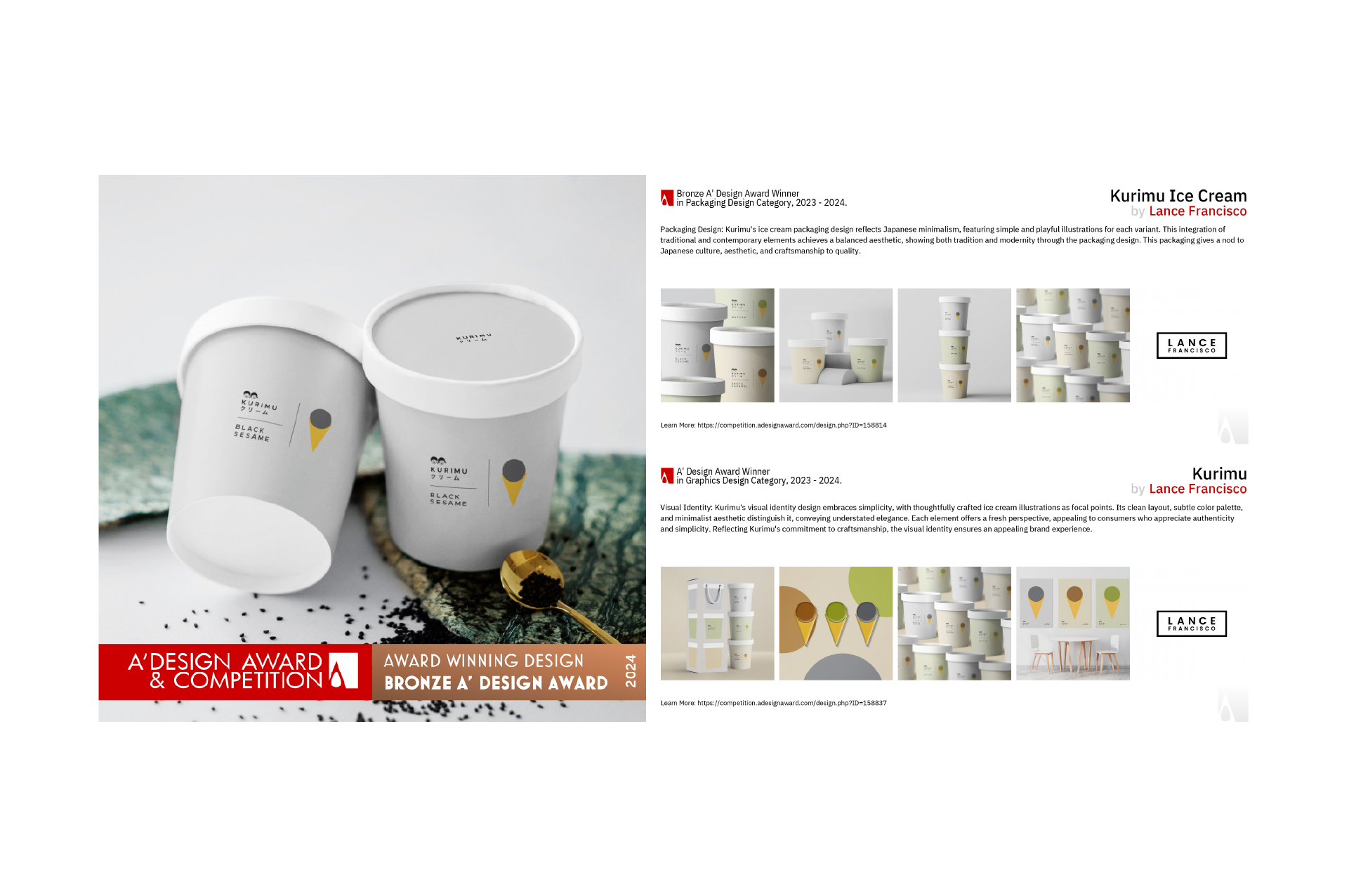
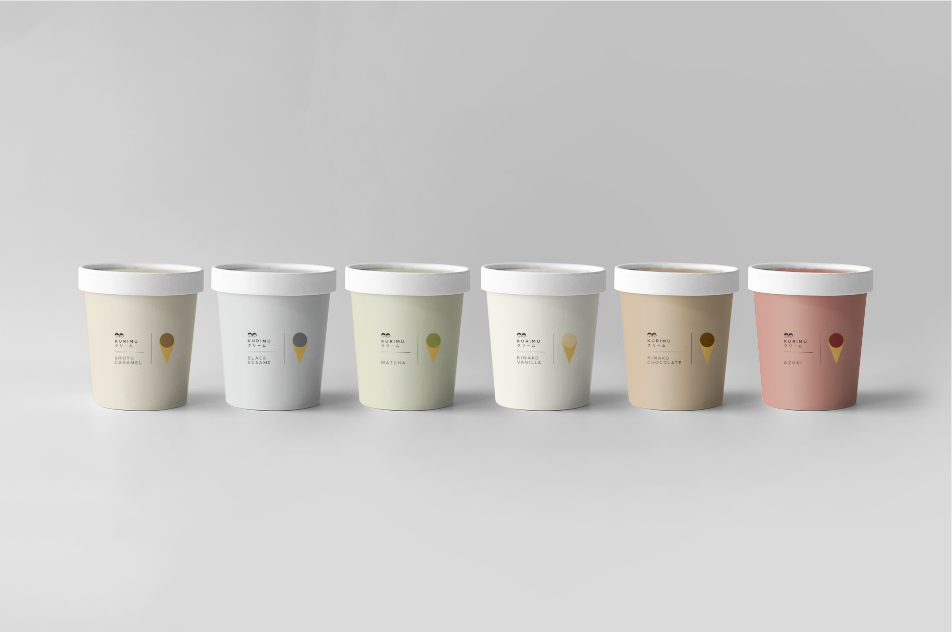
Kurimu
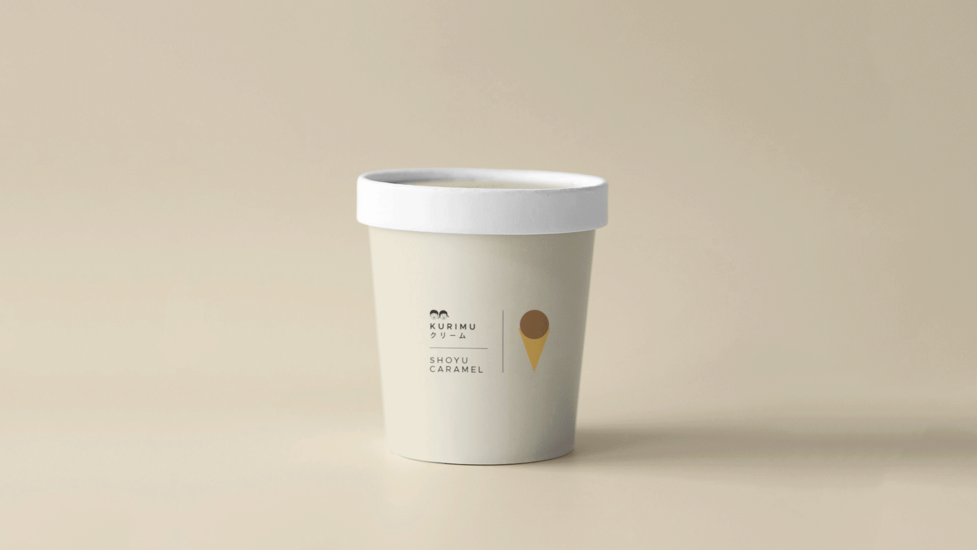
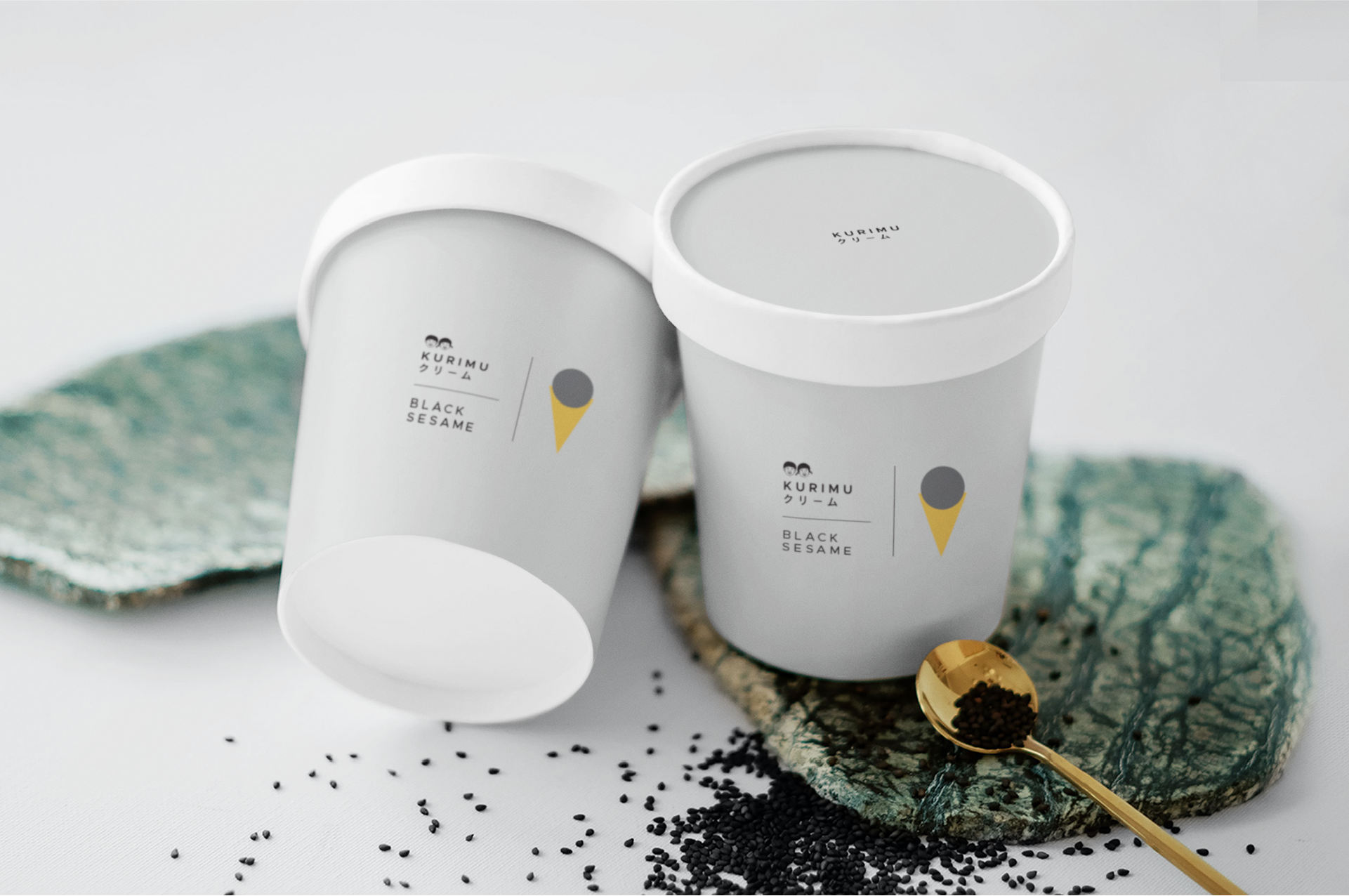
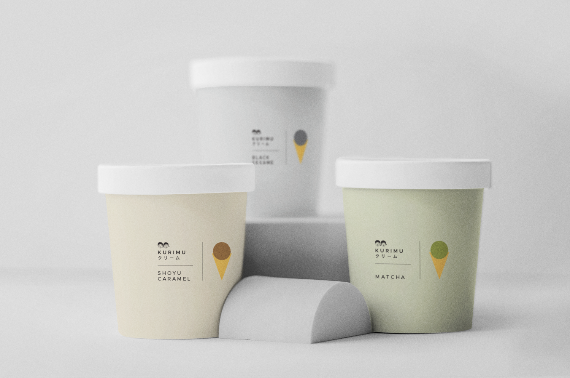
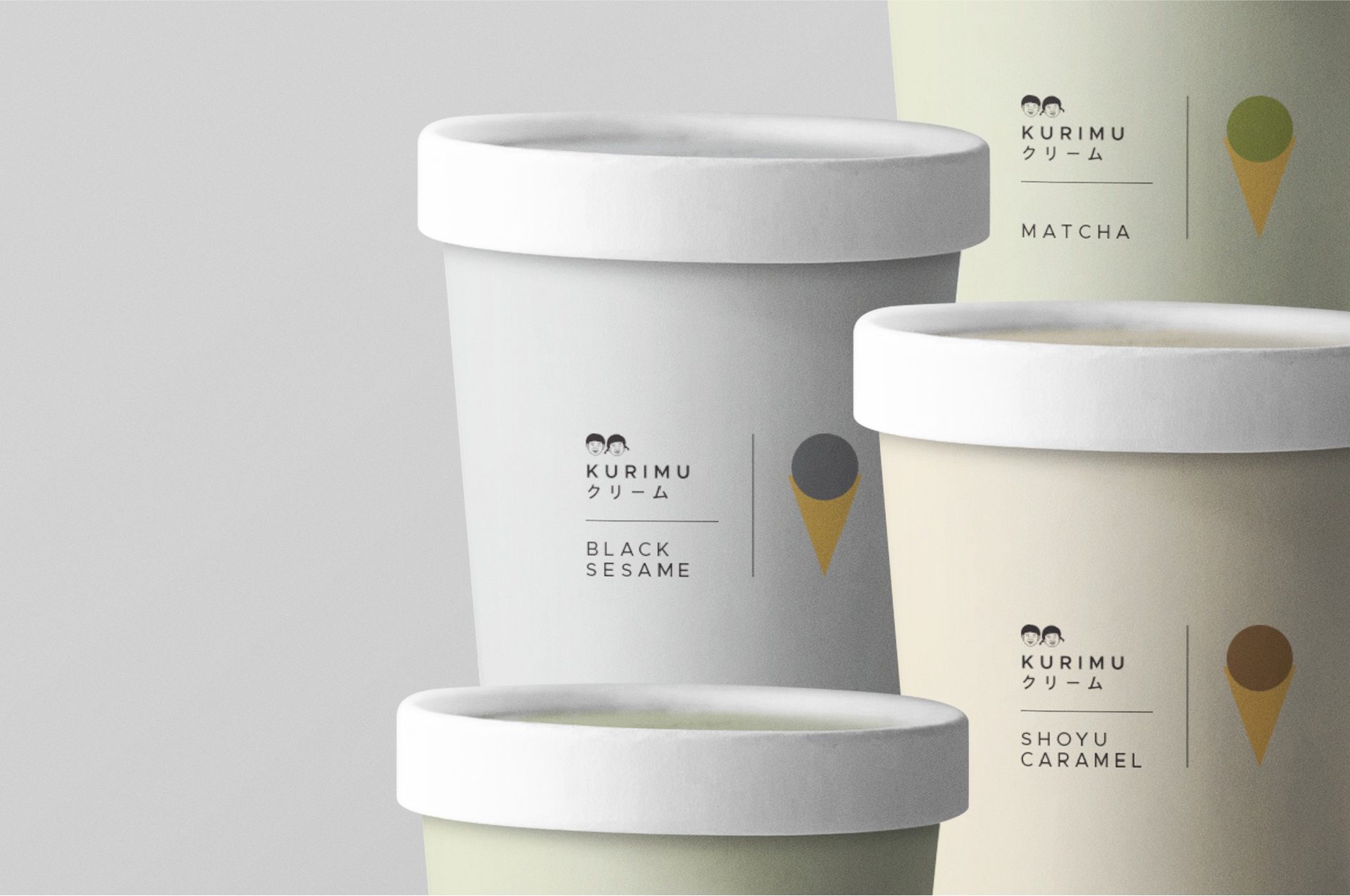
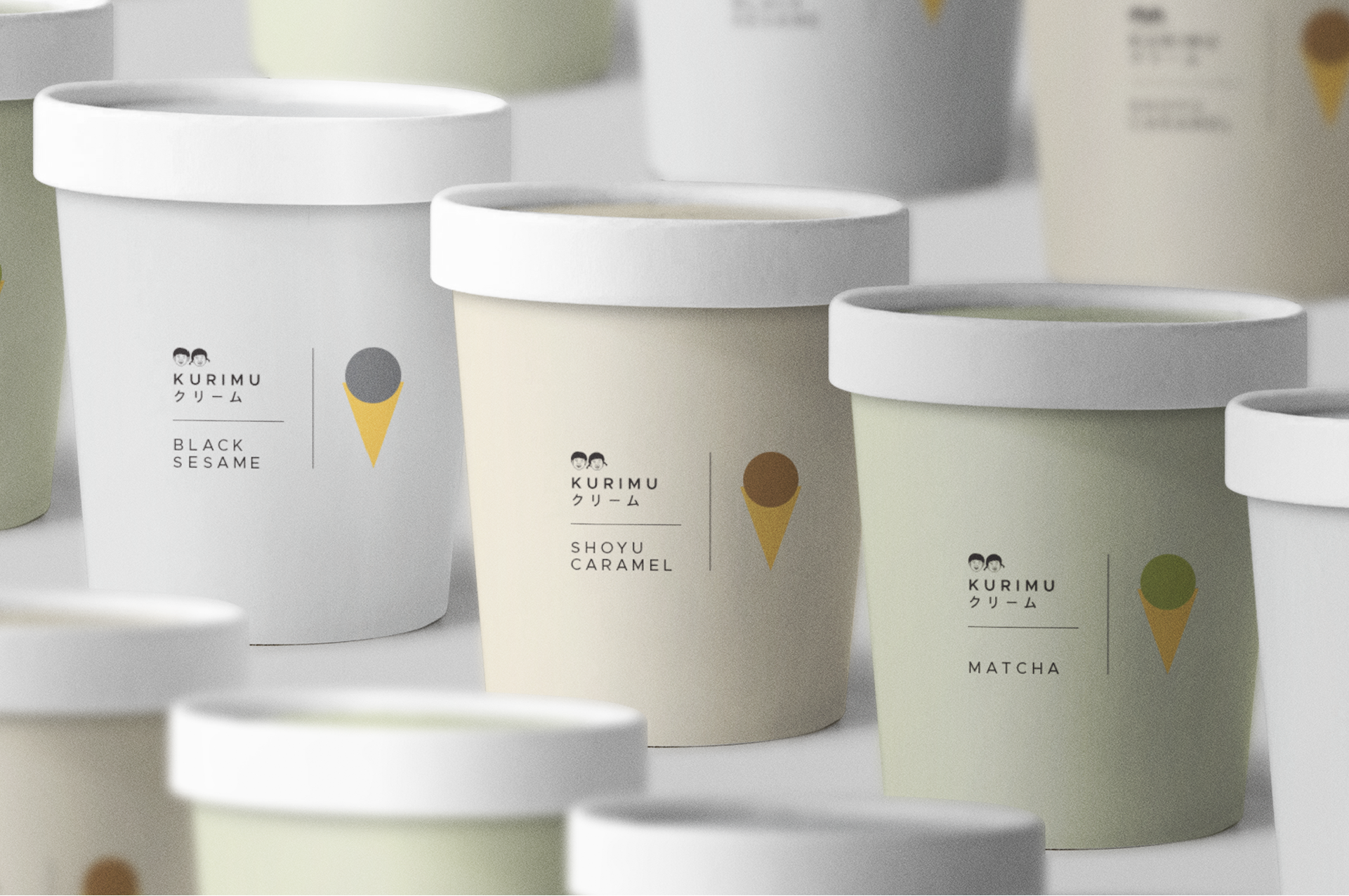
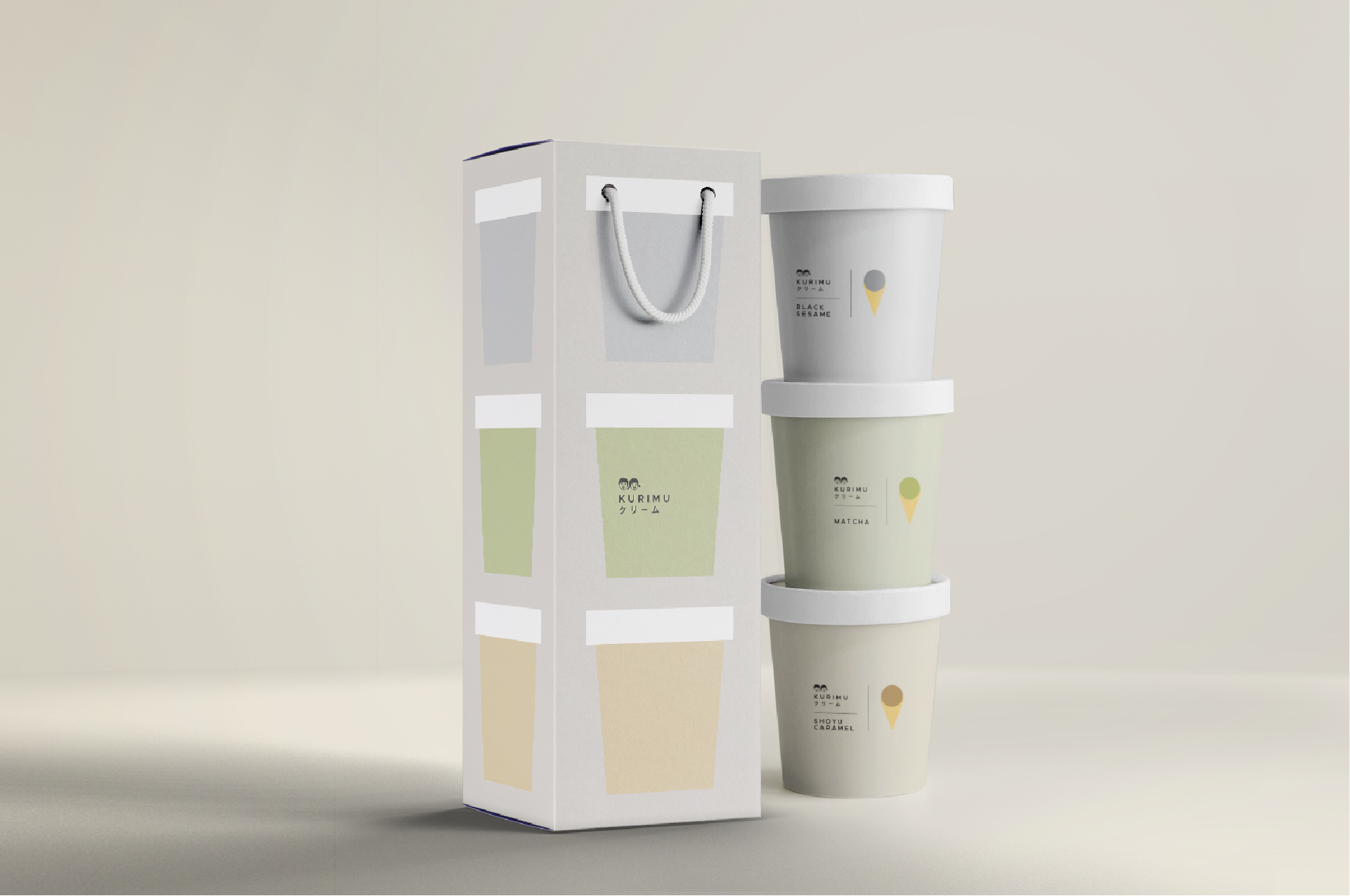
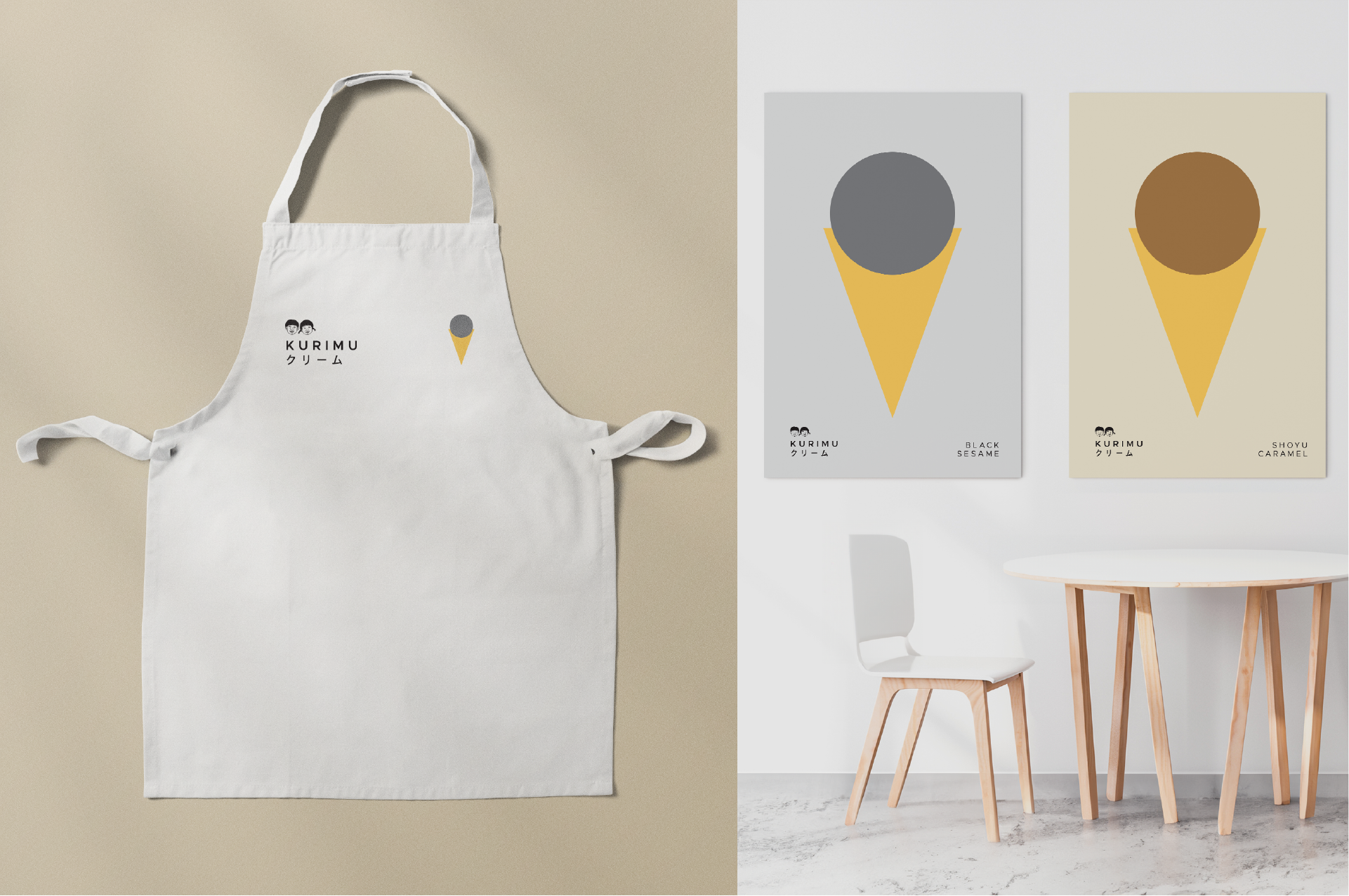
A Japanese-inspired premium dessert brand built on quiet luxury and craft. LLIT developed a full identity system — from packaging to digital menus — using soft neutrals and restrained typography to communicate calm, quality, and artistry.
Elevating a dessert brand through design rooted in craft and calm.
Challenge
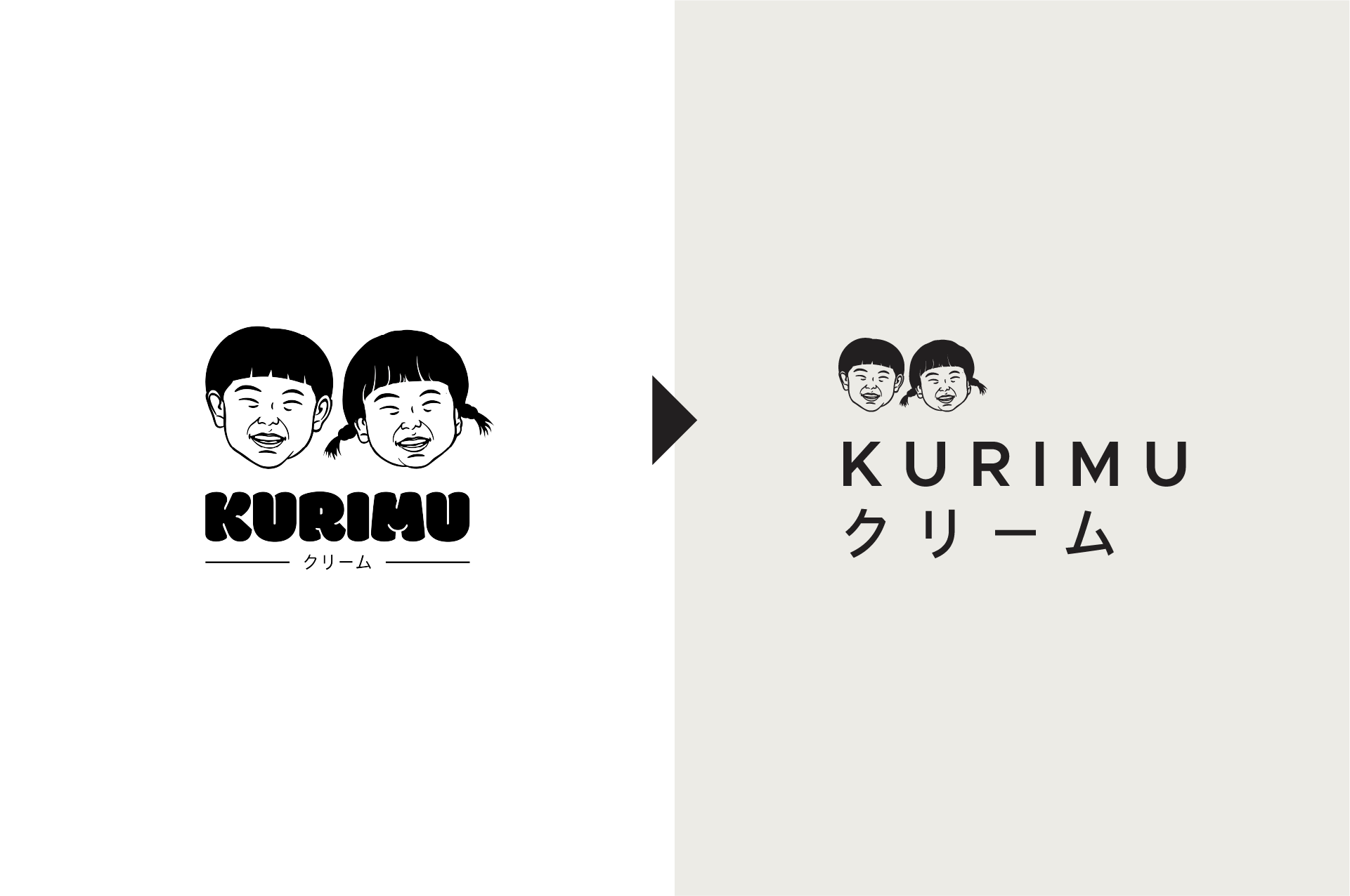
Translating craftsmanship into modern simplicity.
Kurimu wanted to modernize its brand while preserving its handmade authenticity. The challenge was to capture the essence of Japanese minimalism—balance, purity, and form—within a scalable identity system that could move fluidly between packaging, retail, and digital.


No items found.
SCOPE
Brand Identity · Packaging · Retail Design
The final system uses soft neutrals, quiet typography, and precise composition to evoke calm and craftsmanship. Every touchpoint—from boxes to digital menus—communicates restraint and care, reflecting Kurimu’s dedication to quality and artistry.